Please enable JS
15
Customer Segments
100s
Of Courses To Organize
3
Course Formats

Project

American Redcross
Training & Certfication Mobile Redesign

Services Used

Digital Strategy
User Experience
Creative Direction
Visual Design
QA Testing

We helped customers looking for course certifications and licenses find their courses more easily and quickly so that they can get back to work.

The Challenge

Working with The American Red Cross PHSS Division gave us insights into the organization that helped us shape our thinking. With the insights shared from the team, we strove to create design patterns and customer principles that could be used even within the other divisions of the Red Cross.

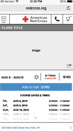
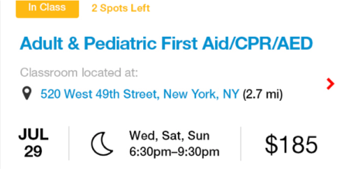
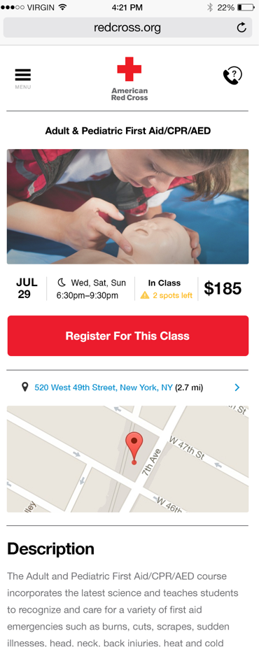
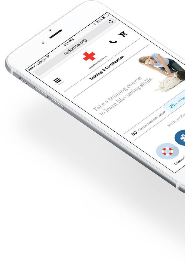
Evaluating the Live Site

Following our standard methodolgy we started out by evaluating the current site for best practice UX and Design issues which we could use to inform our work. This was combined with an analysis of the sites analytics, competitive and comparitive analysis and feedback from site users.

Thinking through the UX

After a thorough analysis of the old site, we defined an experience that put the customer first, helped them find the courses they were looking for and provided recomendations for optimizing the checkout process, allowing users to complete their course registration in less steps.

Homescreen presents classes and persona based navigation

Wireframe

Wireframe

Persona Based Navigation

We also introduced a concept that would help users find the courses they needed based on their job / role. We referred to this a a persona based navigation and designed an icon system to communite those different roles. Faster access to courses organized by role allowed users to see what courses they needed to maintain their licences and certifications.

Lifeguards & Swin Coaches

EMT

Nurse

Babysitter

Fire & Rescue

Healthcare

Public Safety

Workplace Safety

Instructors

Health Services

Police Officer

Educational Services

15

Professional Customer Segments designed for.

Looking for Answers:

When thinking about how to design an updated site for users we considered design trends such as information cards, persona based wayfinding and efficient commerce and checkout patterns.

We designed an easily scannable information card of course information that informed users of the class, format, seat inventory, address, date, hours and price in a very small area, bringing this information to the front allowed users to make purchase decisions faster.

Information Design is Key

We were sticklers when it came to not only designing our icon set, but also when it was time to think about brand guidelines and primary and secondary color pallettes. By using colors in a consisten manner users are trained to look for things such as links, course format, action button and supplemental and expandable inforamtion. We also ensured that our design was modern, adhered to good mobile and material design principles and was easy on the eyes.

Brazen’s work at the American Red Cross helped improve the Training and Certification’s Division bottom line by improving the mobile site and digital brand.

Avatar - Vince Scordo.
Digital Director, American Red Cross

Want to see more?

Contact
1 / 3
What’s your name?
Please provide a name.
Next
2 / 3
What’s your email address?
Back Next
3 / 3
What’s on your mind?
Please provide a message.
Back Send
Thank you.
Your message is important to us. We’ll get back to you within 2 business days.
New Message